Fishing
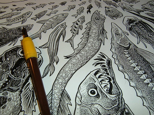
Some interesting posts over at the Comic Comics blog on the dissolving ties between superhero and literary comics, both in the marketplace and in shared influence. Also good discussion happening in the comment section. Frank Santoro points out David Mazzuchelli as an artist who has deliberately and systematically cut his mainstream stylistic “roots,” for better or worse. It’s a subject I’m interested in, since like I’ve said before, some of my earliest formative comics influences were some truly shitty early-90s Image books. It’s pretty hard to un-learn, and I cringe every time I see my high school self peeking out between the lines. There’s a rich history of painting, children’s illustration, graphic design to draw from, and it’s not all thin-thick-thin pen/brush lines, well-spotted blacks; good anatomy; midshot, closeup, establishing shot. Anyway, even our finest representatives of mainstream comics art come from this weird offshoot of slick pop art. So hard to work outside of those self-imposed limitations… I’ve got my own set of uptight problems, though. Santoro again:
Think of it this way: As “straight-forward” or “realistic” Clowes’ style in Ghost World is to a schooled comics reader, it looks baroque and affected to a non-comics reader.
I love Clowes, but I suspect this is true. I think Ghost World benefited from this in a lot of ways – “it’s like a comic book, but kicky!” But that only works so many times. Is the “comics style” intrinsically better or worse than any other style of representative art? I guess not, but any road becomes a dead end if it doesn’t go anywhere.

Discussion ¬